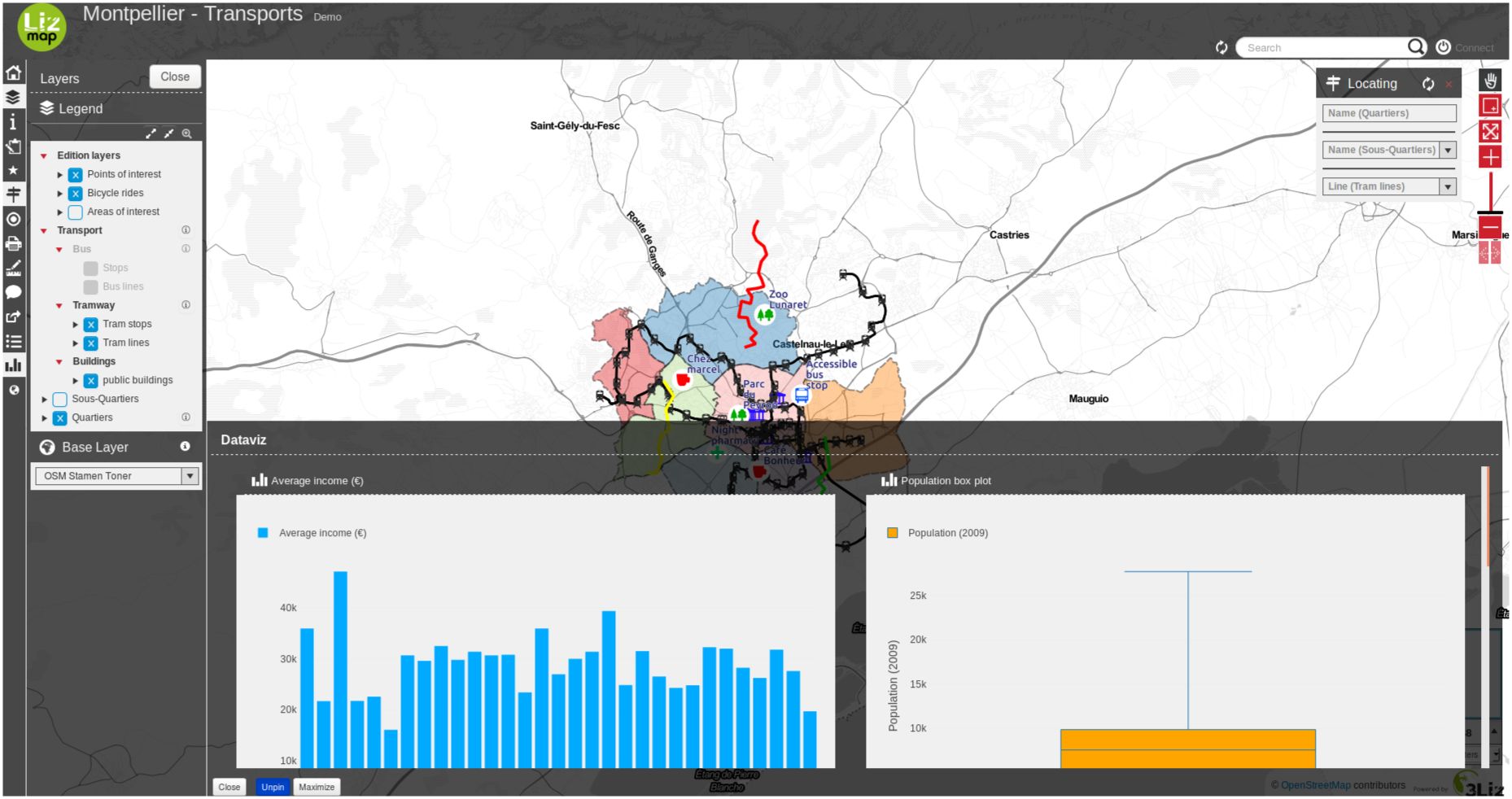
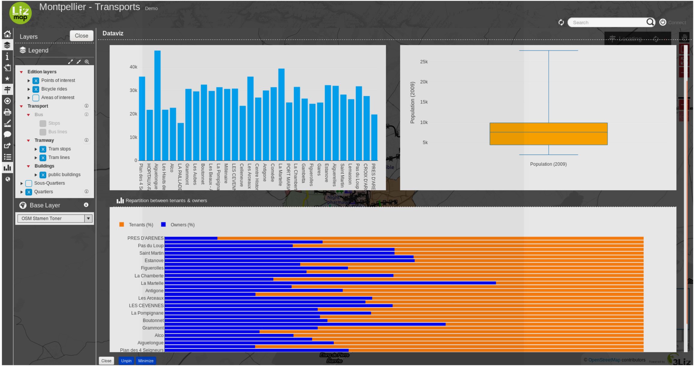
Dataviz — Display some charts
Principle
With the dataviz panel, you can create a few kinds of graph with only a few clicks:
scatter
pie
histogram
box
bar
histogram2d
polar
sunburst
HTML
Prerequisites
The layer must be published as WFS (see WFS/OAPI) and the primary key must be published as well in the Layer properties.
Video tutorial
This video is an quick start how to setup a filtered chart in a parent popup.
Configuring the tool
Tip
You can start using the plugin DataPlotly to create your graph in QGIS itself.
So you can have a preview about what is possible more or less about dataviz with your layers.
But keep in mind that Lizmap and DataPlotLy, even if’s using the same dataviz engine
(plotly), features are different between these two tools.
You can easily configure it with the plugin Lizmap in QGIS in the Dataviz panel.
At the layer level
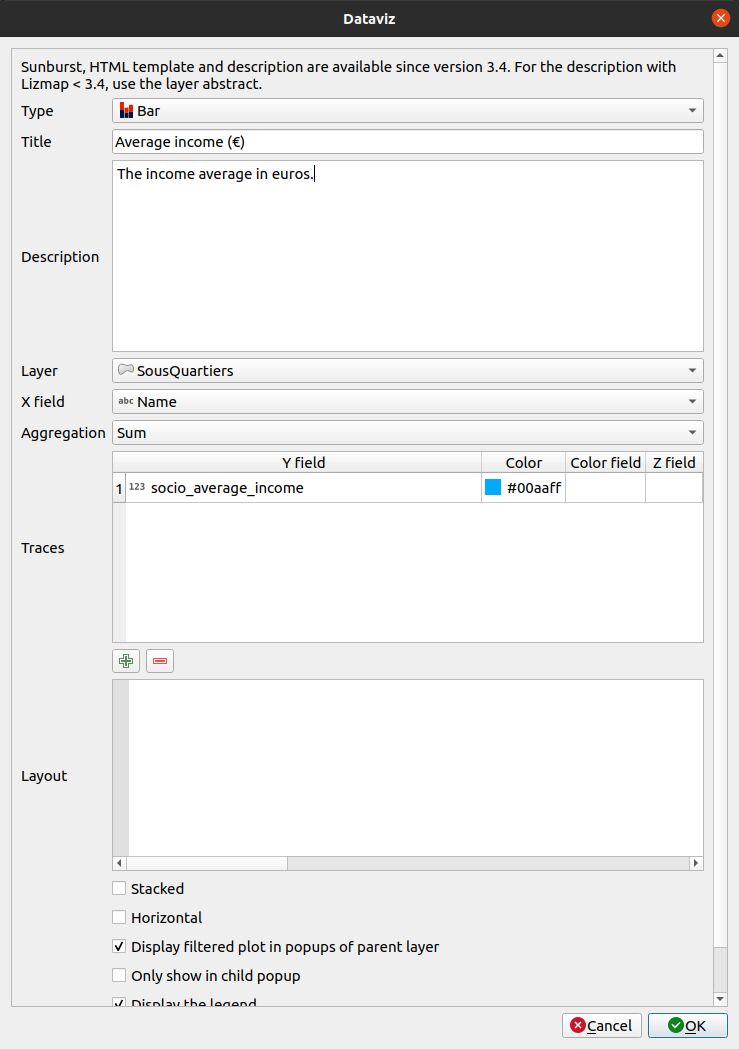
To enable a layer with dataviz capabilities:
Click the
 button.
Select the type of chart to add. According to your choices, the form will adapt it self. Read below the kind of charts.
Title : Here you can write the title you want for your chart.
Description : The description of the chart. You can include HTML.
Select the layer in the drop-down list.
X field : The X field of your graph. It might be empty for a few types.
- AggregationFor a few types of charts like bar or pie, you can chose to aggregate the data in
the graph. There are a few aggregate functions available - average(avg), sum, count, median, stddev, min, max, first, last.
Traces : Depending of the kind of chart, you can add one or many traces : the Y field of your graph.
Depending of the kind of chart, there is now different options.
Layout : The layout can be customized. It must be a JSON dictionary. You can read the documentation of Plotly about the layout configuration
Display filtered plot in popups of parent layer : if you check this checkbox, the children of your layer will get the same graph as the parent plot but filtered only for them. It’s useful if you want to see the statistics of one entity instead of all.
Only show child popup : The main graph will not be shown in the main container and only the filtered graph of the relation of the layer will be displayed in the popup when you select the element.
Display the legend, sometimes, the legend is not necessary.
Display plot only when the layer is visible.
Some options might be visible or not according to the kind of chart, like choosing for horizontal/vertical layout for a bar chart.
To edit a layer in the table, select it and click the
 button or double click on the row.
To remove a layer from the table, select it and click the
 button.
To move a layer up or down, select it and click
 or
or  buttons. The order will change in Lizmap too.
Fields will be displayed with their alias if it’s defined. See Add a alias on a field.
At the project level
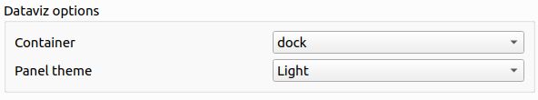
1. You have the possibility to change the value to dock, bottomdock or right-dock these options change where your dataviz panel will be located in your Lizmap’s project. You have 3 positions available, at the right of the screen, bottom and right.
2. You have the possibility to write in HTML the layout of the container of your charts. If you are proficient in the HTML language, there are a lot of possibilities and you can customize your container the way you want.
For instance, this bootstrap HTML code will produce the layout below:
<div class="container-fluid">
    <div class="row-fluid">
        <div class="span6">$0</div>
        <div class="span6">$1</div>
    </div>
    <div class="row-fluid">
        <div class="span12">$2</div>
    </div>
</div>
JSON layout
The layout option, allows you to configure many options by writing up a JSON object. See the full reference on the Plotly documentation.
The following examples show how to use some properties depending of the layout property:
Add units in the Y (vertical) axis numbers:
// Add " ha" suffix
{"yaxis": {"ticksuffix": " ha"}}
Remove labels in the X (horizontal) axis:
// Hode X labels. Use yaxis for Y labels
{"xaxis": {"showticklabels": false}}
Remove the automatic k, M or G suffix (ex: 10 M) for big number in the axis and in the hover tooltip:
{"yaxis": {"tickformat": ",.2f"}}
Order of the bars for a bar chart. Use ascending or descending values:
// By ascending X value
{"xaxis": {"categoryorder": "category ascending"}}

// By descending bar height (total Y value)
{"xaxis": {"categoryorder": "total ascending"}}
Set margins. Use l for left, t for top, r for right and b for bottom:
// Shift the plot to the right (to display big Y axis labels)
{"margin": {"l": 70}}
Define font properties:
// Change X axis font size
{"xaxis": {"tickfont": {"size": 10}}}
You can combine any of the properties, for example:
{
    "xaxis": {
        "categoryorder": "total ascending"
        "tickfont": {
            "size": 10
        }
    },
    "yaxis": {
        "showticklabels": false
    }
}
Other customisation with JavaScript scripts
We can also modify charts with some JavaScript scripts.
You can decide to not have any number after the comma for the first chart (ID
dataviz_plot_0), for example:
lizMap.events.on({
    'datavizplotloaded': (evt) => {
        if( evt.id === 'dataviz_plot_0'){
            Plotly.restyle( evt.id, {
                texttemplate: "%{value:.0f}"
            });
        }
    }
});
You can decide to display lines and markers (documentation) for a scatter chart (ID
dataviz_plot_1), for example:
lizMap.events.on({
    'datavizplotloaded': (evt) => {
        if( evt.id === 'dataviz_plot_1'){
            Plotly.restyle( evt.id, {
                mode: "lines+markers"
            });
        }
    }
});
Types of charts
The dataviz module will aggregate every traces for all unique X values.
HTML templates
A trace must be referenced by {$y1} where 1 is the trace number in the table.
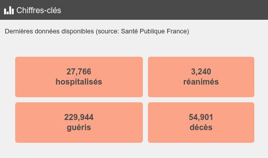
This example below will produce a single colored box, similar to the COVID demo.
<style type="text/css">
table.example-table {
    width: 100%;
    font-weight: bold;
    color:#4a4a4a;
    padding: 10px;
    border-spacing: 10px;
    border-collapse: separate;
}
table.example-table tr td {
    background-color: #fca487;
    border-radius: 5px;
    border: 10px solid #fff0;
    padding: 10px;
    margin: 10px;
    text-align: center;
}
</style>
<table class="example-table">
    <tbody>
        <tr>
            <td>{$y1}</td>
        </tr>
    </tbody>
</table>
Sunburst
Have a look to Sunburst plot on the layer Postes clés in the landuse demo.
Miscellaneous
For pie chart : the items in the legend are ordered by X as a default behaviour.
QGIS Field aliases are used in the tooltip when hovering the bar or pie slices.
Examples
You can visit the Cats project.