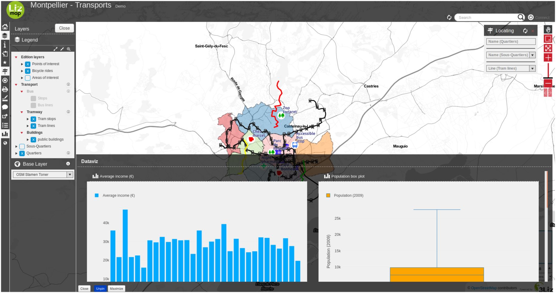
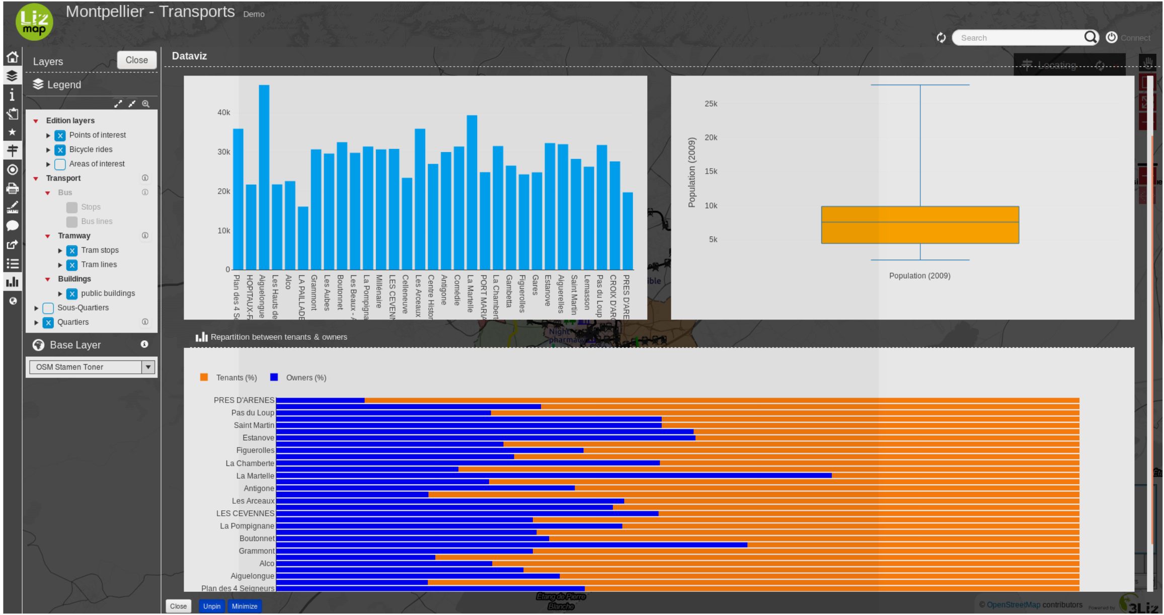
Dataviz — Display some charts
Regola
Con il pannello dataviz, è possibile creare alcuni tipi di grafici con pochi clic:
scatter
pie
histogram
box
barre
istogramma2d
polare
sunburst
HTML
Prerequisiti
Il livello deve essere pubblicato come WFS (vedi WFS/OAPI) e la chiave primaria deve essere pubblicata anche nelle Proprietà del livello.
Video tutorial
This video is an quick start how to setup a filtered chart in a parent popup.
Configurazione del plugin
Suggerimento
You can start using the plugin DataPlotly to create your graph in QGIS itself.
So you can have a preview about what is possible more or less about dataviz with your layers.
But keep in mind that Lizmap and DataPlotLy, even if’s using the same dataviz engine
(plotly), features are different between these two tools.
Puoi facilmente configurarlo con il plugin Lizmap in QGIS nel pannello Dataviz.
Al livello di layer
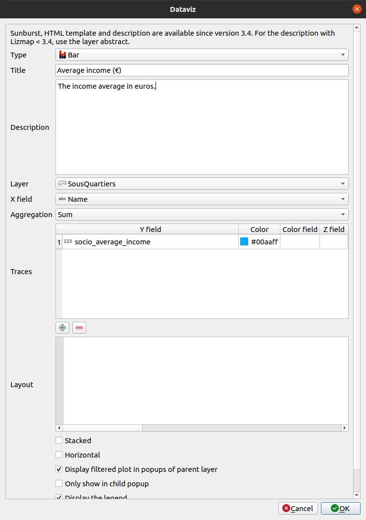
Per abilitare un livello con capacità di dataviz:
Fai clic sul pulsante
 .
.Seleziona il tipo di grafico da aggiungere. In base alle tue scelte, il modulo si adatterà da solo. Leggi qui sotto il tipo di grafici.
Titolo : Qui puoi scrivere il titolo che vuoi per il tuo grafico.
Descrizione : La descrizione del grafico. Puoi includere l’HTML.
Seleziona il livello nell’elenco a discesa.
Campo X : Il campo X del tuo grafico. Potrebbe essere vuoto per alcuni tipi.
- AggregazionePer alcuni tipi di grafici come a barre o a torta, puoi scegliere di aggregare i dati
il grafico. Ci sono alcune funzioni aggregate disponibili - average(avg), sum, count, median, stddev, min, max, first, last.
Tracce : A seconda del tipo di grafico, potete aggiungere una o molte tracce: il campo Y del vostro grafico.
A seconda del tipo di grafico, ci sono ora diverse opzioni.
Layout : The layout can be customized. It must be a JSON dictionary. You can read the documentation of Plotly about the layout configuration
Visualizza il grafico filtrato nei popup del livello padre : se selezioni questa casella, i figli del tuo livello otterranno lo stesso grafico del livello padre ma filtrato solo per loro. È utile se vuoi vedere le statistiche di una sola entità invece di tutte.
Mostra solo il popup figlio : Il grafico principale non sarà mostrato nel contenitore principale e solo il grafico filtrato della relazione del livello sarà visualizzato nel popup quando si seleziona l’elemento.
Visualizza la leggenda, a volte, la leggenda non è necessaria.
Visualizza il plot solo quando il livello è visibile.
Alcune opzioni potrebbero essere visibili o meno a seconda del tipo di grafico, come la scelta del layout orizzontale/verticale per un grafico a barre.
Per modificare un livello nella tabella, selezionalo e clicca sul pulsante
 o fai doppio clic sulla riga.
Per rimuovere un livello dalla tabella, selezionalo e clicca sul pulsante
 .
.Per spostare un livello in alto o in basso, selezionatelo e cliccate sui pulsanti
 o
o  . L’ordine cambierà anche in Lizmap.
I campi saranno visualizzati con il loro alias se è definito. Vedi Aggiungere un alias ad un campo.
A livello di progetto
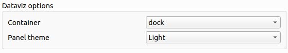
1. You have the possibility to change the value to dock, bottomdock or right-dock these options change where your dataviz panel will be located in your Lizmap’s project. You have 3 positions available, at the right of the screen, bottom and right.
2. You have the possibility to write in HTML the layout of the container of your charts. If you are proficient in the HTML language, there are a lot of possibilities and you can customize your container the way you want.
Per esempio, questo codice HTML di bootstrap produrrà il layout qui sotto:
<div class="container-fluid">
    <div class="row-fluid">
        <div class="span6">$0</div>
        <div class="span6">$1</div>
    </div>
    <div class="row-fluid">
        <div class="span12">$2</div>
    </div>
</div>
Layout JSON
The layout option, allows you to configure many options by writing up a JSON object. See the full reference on the Plotly documentation.
I seguenti esempi mostrano come utilizzare alcune proprietà in base alla proprietà di layout:
Aggiungere unità nei numeri dell’asse Y (verticale):
// Add " ha" suffix
{"yaxis": {"ticksuffix": " ha"}}
Rimuovere le etichette nell’asse X (orizzontale):
// Hode X labels. Use yaxis for Y labels
{"xaxis": {"showticklabels": false}}
Rimuovere il suffisso automatico k, M o G (es: 10 M) per il grandi numeri nell’asse e nell’hover tooltip:
{"yaxis": {"tickformat": ",.2f"}}
Ordine delle barre per un grafico a barre. Usa valori ascendenti o discendenti:
// By ascending X value
{"xaxis": {"categoryorder": "category ascending"}}

// By descending bar height (total Y value)
{"xaxis": {"categoryorder": "total ascending"}}
Impostare i margini. Usa l per sinistra, t per sopra, r per destra e b per sotto:
// Shift the plot to the right (to display big Y axis labels)
{"margin": {"l": 70}}
Definire le proprietà dei font:
// Change X axis font size
{"xaxis": {"tickfont": {"size": 10}}}
Potete combinare qualsiasi proprietà, per esempio:
{
    "xaxis": {
        "categoryorder": "total ascending"
        "tickfont": {
            "size": 10
        }
    },
    "yaxis": {
        "showticklabels": false
    }
}
Other customisation with JavaScript scripts
We can also modify charts with some JavaScript scripts.
You can decide to not have any number after the comma for the first chart (ID
dataviz_plot_0), for example:
lizMap.events.on({
    'datavizplotloaded': (evt) => {
        if( evt.id === 'dataviz_plot_0'){
            Plotly.restyle( evt.id, {
                texttemplate: "%{value:.0f}"
            });
        }
    }
});
You can decide to display lines and markers (documentation) for a scatter chart (ID
dataviz_plot_1), for example:
lizMap.events.on({
    'datavizplotloaded': (evt) => {
        if( evt.id === 'dataviz_plot_1'){
            Plotly.restyle( evt.id, {
                mode: "lines+markers"
            });
        }
    }
});
Tipi di grafici
Il modulo dataviz aggregherà ogni tracce per tutti i valori unici X.
Modelli HTML
A trace must be referenced by {$y1} where 1 is the trace number in the table.
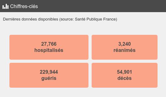
This example below will produce a single colored box, similar to the COVID demo.
<style type="text/css">
table.example-table {
    width: 100%;
    font-weight: bold;
    color:#4a4a4a;
    padding: 10px;
    border-spacing: 10px;
    border-collapse: separate;
}
table.example-table tr td {
    background-color: #fca487;
    border-radius: 5px;
    border: 10px solid #fff0;
    padding: 10px;
    margin: 10px;
    text-align: center;
}
</style>
<table class="example-table">
    <tbody>
        <tr>
            <td>{$y1}</td>
        </tr>
    </tbody>
</table>
Sunburst
Have a look to Sunburst plot on the layer Postes clés in the landuse demo.
Varie
Per grafici a torta : gli elementi della legenda sono ordinati per X come comportamento predefinito.
Gli alias dei campi QGIS sono usati nel suggerimento degli strumenti quando si passa il mouse sulla barra o sulle fette di torta.
Esempi
You can visit the Cats project.