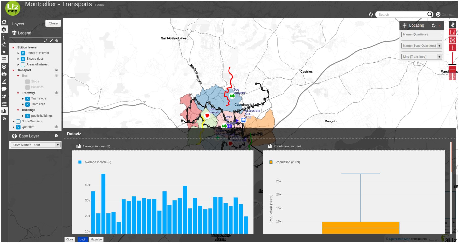
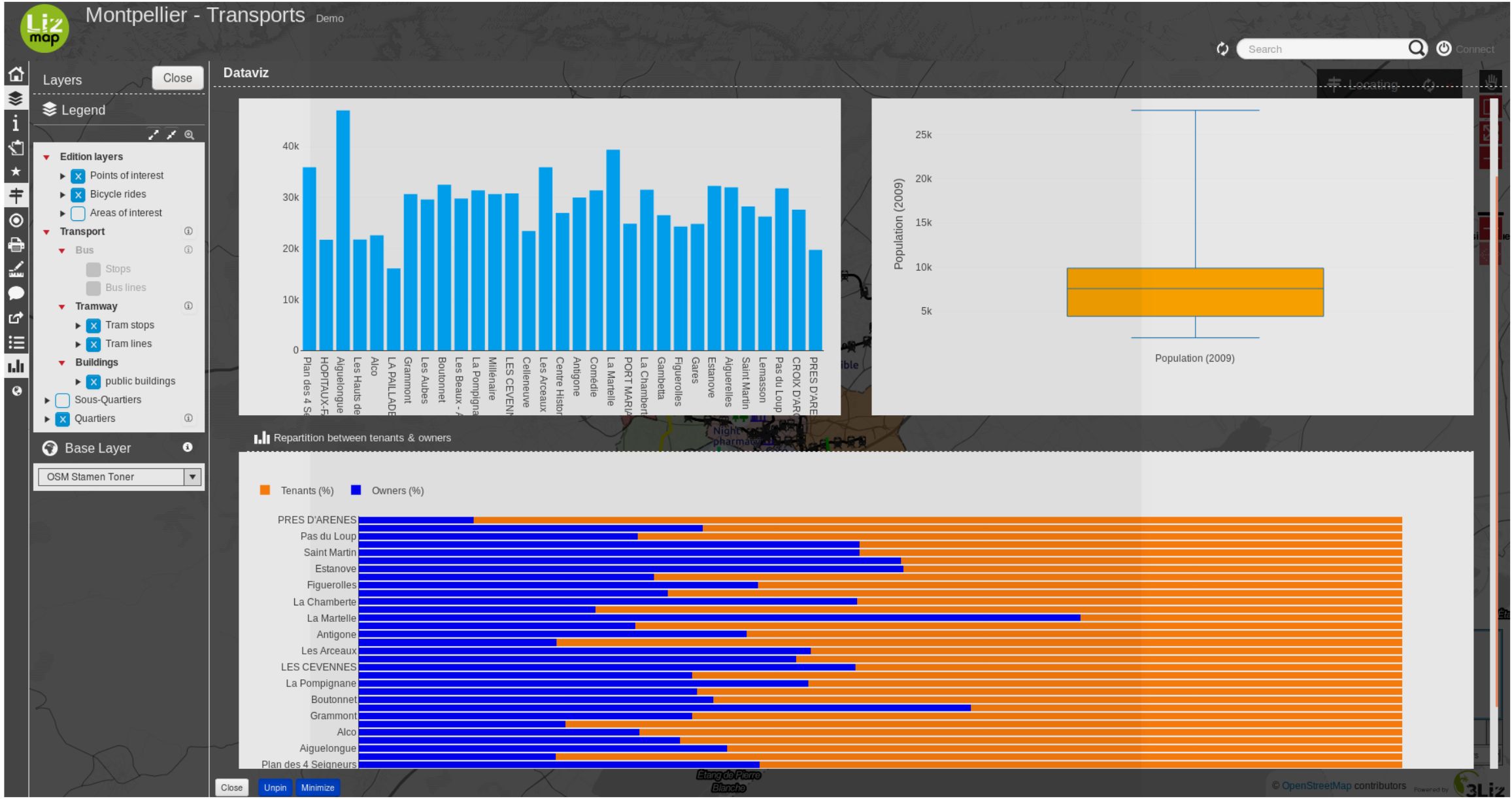
Dataviz — Display some charts
定義
データ可視化 パネルを使用すると、数回のクリックで数種類のグラフを作成できます。
分散
円
ヒストグラム
積上棒グラフ
棒グラフ
ヒストグラム2d
極座標グラフ
sunburst
HTML
前提条件
レイヤーは WFS として公開する必要があり ( WFS/OAPI を参照)、主キーは 、同様に公開する必要があります。 :guilabel:` レイヤプロパティ ` で同様に公開する必要があります。
ビデオチュートリアル
This video is an quick start how to setup a filtered chart in a parent popup.
ツールの設定
Tip
You can start using the plugin DataPlotly to create your graph in QGIS itself.
So you can have a preview about what is possible more or less about dataviz with your layers.
But keep in mind that Lizmap and DataPlotLy, even if's using the same dataviz engine
(plotly), features are different between these two tools.
あなたは簡単に:guilabel:` データ可視化 `パネルでQGISのlizmapプラグインで設定することができます。
レイヤー レベルで
データの可視化機能を使用してレイヤーを有効にするには:
ボタン
 をクリックします。
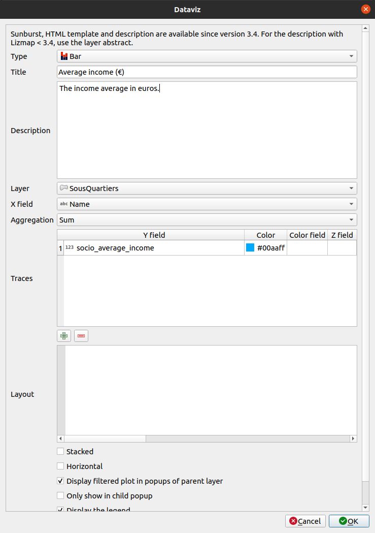
追加するチャートの種類を選択します。選択した内容に応じて、フォームが自動的に適応します。チャートの種類は以下の通りです。
**タイトル** :ここでは、あなたのチャートにしたいタイトルを書くことができます。
**説明** : グラフの説明。HTML を含めることができます。
ドロップダウンリストから レイヤーを選択 します。
**Xフィールド** : グラフの X フィールド。いくつかのタイプでは空になる可能性があります。
- ** 集計 **For a few types of charts like bar or pie, you can chose to aggregate the data in
グラフで利用できる集計関数があります - average(avg), sum, count, median, stddev, min, max, first, last.
**トレース** :チャートの種類に応じて、1つまたは複数のトレースを追加することができます: グラフのYフィールド。
グラフの種類に応じて、さまざまなオプションが表示されます。
Layout : The layout can be customized. It must be a JSON dictionary. You can read the documentation of Plotly about the layout configuration
**上位レイヤーの地物情報でフィルタされたプロットを表示** : このチェックボックスをオンにすると、レイヤーの下位は上位プロットと同じグラフを取得しますが、それらについてのみフィルタリングされます。これは、すべてのエンティティではなく 1 つのエンティティの統計情報を表示する場合に便利です。
**下位地物情報のみを表示** : メイングラフはメインコンテナに表示されず、要素を選択すると、レイヤーのリレーションのフィルタリングされたグラフのみが地物情報に表示されます。
**凡例を表示** 、時には、凡例は必要ありません。
**レイヤが表示されている場合にのみプロットを表示** 。
棒グラフの水平/垂直レイアウトの選択など、グラフの種類に応じて表示されるオプションもあります。
テーブル内のレイヤーを編集するには、レイヤーを選択して、
 ボタンをクリックするか、行をダブルクリックします。
テーブルからレイヤーを削除するには、レイヤーを選択して、
 ボタン。
ボタン。レイヤーを上下に移動するには、レイヤーを選択して
 または
または  ボタン。lizmapでも順序が変わります。
フィールドが定義されている場合は、エイリアスとともにフィールドが表示されます。参照してください フィールドに別名を追加する 。
プロジェクト レベルで
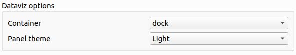
1. You have the possibility to change the value to dock, bottomdock or right-dock these options change where your dataviz panel will be located in your Lizmap's project. You have 3 positions available, at the right of the screen, bottom and right.
2. チャートのコンテナのレイアウトを HTML で記述することができます。HTML 言語に堪能な場合は、自由にコンテナをカスタマイズできます。
たとえば、このブートストラップ HTML コードは、次のレイアウトを生成します。
<div class="container-fluid">
    <div class="row-fluid">
        <div class="span6">$0</div>
        <div class="span6">$1</div>
    </div>
    <div class="row-fluid">
        <div class="span12">$2</div>
    </div>
</div>
JSON レイアウト
The layout option, allows you to configure many options by writing up a JSON object. See the full reference on the Plotly documentation.
次の例は、レイアウト プロパティに応じて一部のプロパティを使用する方法を示しています。
Y (垂直) 軸番号に単位を追加します。
// Add " ha" suffix
{"yaxis": {"ticksuffix": " ha"}}
X (水平) 軸のラベルを削除します。
// Hode X labels. Use yaxis for Y labels
{"xaxis": {"showticklabels": false}}
軸とホバー ツールチップの大きな数値の自動 'k'、'M'または 'G'サフィックス(例: '10 M')を削除します。
{"yaxis": {"tickformat": ",.2f"}}
棒グラフのバーの順序。昇順または降順の値を使用します。
// By ascending X value
{"xaxis": {"categoryorder": "category ascending"}}

// By descending bar height (total Y value)
{"xaxis": {"categoryorder": "total ascending"}}
余白を設定します。左には 'l' 、上に 't'、右に 'r' 、下に 'b' を使用します。
// Shift the plot to the right (to display big Y axis labels)
{"margin": {"l": 70}}
フォントプロパティを定義します。
// Change X axis font size
{"xaxis": {"tickfont": {"size": 10}}}
次の例に示すプロパティを組み合わせることができます。
{
    "xaxis": {
        "categoryorder": "total ascending"
        "tickfont": {
            "size": 10
        }
    },
    "yaxis": {
        "showticklabels": false
    }
}
Other customisation with JavaScript scripts
We can also modify charts with some JavaScript scripts.
You can decide to not have any number after the comma for the first chart (ID
dataviz_plot_0), for example:
lizMap.events.on({
    'datavizplotloaded': (evt) => {
        if( evt.id === 'dataviz_plot_0'){
            Plotly.restyle( evt.id, {
                texttemplate: "%{value:.0f}"
            });
        }
    }
});
You can decide to display lines and markers (documentation) for a scatter chart (ID
dataviz_plot_1), for example:
lizMap.events.on({
    'datavizplotloaded': (evt) => {
        if( evt.id === 'dataviz_plot_1'){
            Plotly.restyle( evt.id, {
                mode: "lines+markers"
            });
        }
    }
});
グラフの種類
データの可視化モジュールは、すべての固有の X 値に対してすべての traces を集計します。
HTML テンプレート
A trace must be referenced by {$y1} where 1 is the trace number in the table.
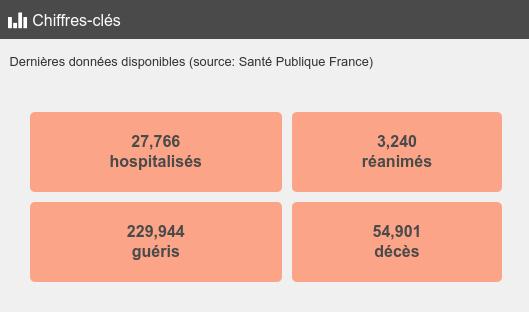
This example below will produce a single colored box, similar to the COVID demo.
<style type="text/css">
table.example-table {
    width: 100%;
    font-weight: bold;
    color:#4a4a4a;
    padding: 10px;
    border-spacing: 10px;
    border-collapse: separate;
}
table.example-table tr td {
    background-color: #fca487;
    border-radius: 5px;
    border: 10px solid #fff0;
    padding: 10px;
    margin: 10px;
    text-align: center;
}
</style>
<table class="example-table">
    <tbody>
        <tr>
            <td>{$y1}</td>
        </tr>
    </tbody>
</table>
Sunburst
Have a look to Sunburst plot on the layer Postes clés in the landuse demo.
その他
**円グラフ** の場合: 凡例の項目は、デフォルトの動作として X で並べ替えられます。
QGISフィールド エイリアス は、棒グラフや円グラフをホバリングするときにツールチップで使用されます。
例
You can visit the Cats project.